Agile workflow
7 min read
Using a Sprint Burndown Chart to Keep Your Product on Track
Thu Apr 29 2021
Keeping stakeholders in the loop is one of the key responsibilities of a product owner. A ton of work goes on behind the scenes before stakeholders can be presented with information about a product's deliverables and timeline. If sprints are your framework for getting work done and projecting delivery dates, the agile development team needs a way to make sure it's working through the product backlog at the right pace. The sprint burndown chart can show you the way.
In this post, we’ll talk about how to use a sprint burndown chart to monitor if your team is on track to complete its work and how putting user stories into sprints and epics generates even greater insights via user story maps.
What is a sprint burndown chart?

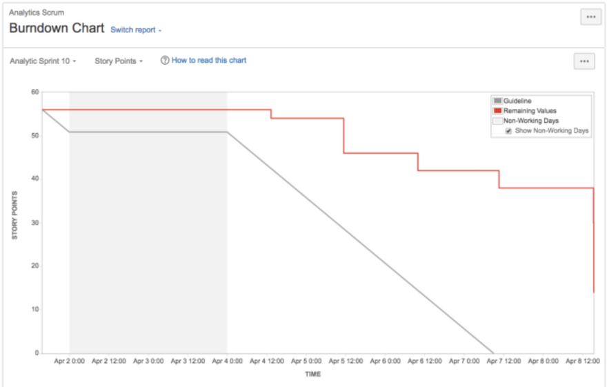
Image credit: Atlassian
First, a review: A sprint is a fixed period of time — typically between two and four weeks — that an agile software development team uses to complete a defined set of work.
A sprint burndown chart is a visual comparison of how much work has been completed during a sprint and the total amount of work remaining. It helps measure a Scrum team's progress, and it provides an easy view of whether the team needs to make any adjustments to complete its work for the current sprint iteration.
A burndown chart is a graph with a y-axis and x-axis 📉. The vertical axis measures the total amount of work that the team estimates it will complete during its current sprint. The horizontal axis shows the number of days remaining until the end of the sprint. On the chart are two lines: the actual work line (a line that represents the team's progress) and the ideal work line (a straight line from the top of the y-axis to the end of the x-axis).
You want your actual work line to follow your ideal work line as closely as possible. This would mean that work is being completed incrementally and at such a rate that it can be completed by the end of the sprint. Sprint goal achieved. 👍
A good practice for a team's product owner is to review the burndown chart on a daily basis. Doing so will allow you to detect if there are any progress issues happening in the sprint. For example, if your actual work line is trending above the ideal work line, then too much work remains to be completed by the end of the sprint at the current pace. We'll break down a few reasons why this may be happening later in the post. 😉
The sprint burndown chart is also a great tool to use during a sprint retrospective. Looking at this as a team can help generate talking points to discuss around the sprint retrospective's three key questions: What went well in the sprint? What didn't go as well as we hoped? How can we get better in the next sprint?
A primer on estimation methods

To measure effort on the vertical axis, we need to choose a metric.
Historically, traditional software teams used time to estimate the effort needed to complete a task or a project. For example, "I think it will take me three days to finish that user story." However, this approach can be risky because people tend to underestimate the amount of time it will take to finish a project.
The unit of measure on your sprint burndown chart's y-axis will depend on your estimation metric of choice. Let's review two common ones employed by agile sprint teams.
Ideal days
An ideal day is an estimate by a software developer of how many uninterrupted days it will take to complete a task. Assuming an ideal workday is eight hours of interruption-free work, the estimate could be stated as, "That user story will take me two ideal days." A benefit of this approach is that it accounts for work disruptions; however, it can be problematic because it often positions estimates as best-case scenarios.
Story points
Agile teams use story points as a relative estimate of effort as opposed to a time-based approach. Instead of saying, "I think this task will take me two days to finish," you would state, "I think this task is worth two story points." In this estimation technique, two story points are twice the effort than one story point.
Teams can use ideal days as a baseline to calibrate their story point estimates. For example, one ideal day can be equivalent to one story point, two ideal days to two story points, and so on.
A main benefit of using story points to estimate is that it allows teams to focus on relative measures of effort instead of thinking about how long it will take to finish a task.
Why your sprint burndown might be off track

A perfect actual burndown line is like Bigfoot — if it's been witnessed, it's probably a hoax. 😂
No team can perfectly estimate its work and develop at the exact pace represented by the ideal line. That said, if you notice large differences between your actual line and the ideal line (i.e., your actual line is much higher or lower than the ideal line), a number of things might be occurring:
- The team over- or under-committed to the amount of work at sprint planning
- Story points were added to or removed from the sprint after it started (scope creep)
- The estimated effort for some user stories is off
As a product owner, when you notice something that's off about your line after your daily review of your chart, you should mention that to your team members. The daily stand up is a perfect time to do so.
User stories and epics provide the big picture
User stories describe how a functional part of a product will work from a user's perspective. The common format of a user story reads, “As a [user role], I want to [user activity] so that I can [user goal].” For example, one might read, “As a new customer, I want to sign up for this product so that I can create my profile.”
User stories are placed in sprints to show what work (from the user's perspective) will be finished and by when. They can also be placed in epics to group them into themes within a product. Epics are widely used by agile teams to represent the high-level activity users will accomplish while using a product.
In our example above, an epic can capture all of the user stories that center around user signup, such as signing up, adding payment information, creating a user profile, and configuring notification settings.
If the sprint burndown indicates that the team is off track for a given sprint, then a combined view of sprints and epics can help you determine what impact that might have in the big picture. And, as we’ll see next, an interactive user story map can fix the problem.
User story maps: A view of epics and sprints

A sprint burndown chart is one of the handiest tools an agile software development team can use to make sure they're working and delivering at a solid pace. The burndown chart shows if any adjustments need to be made to your sprint.
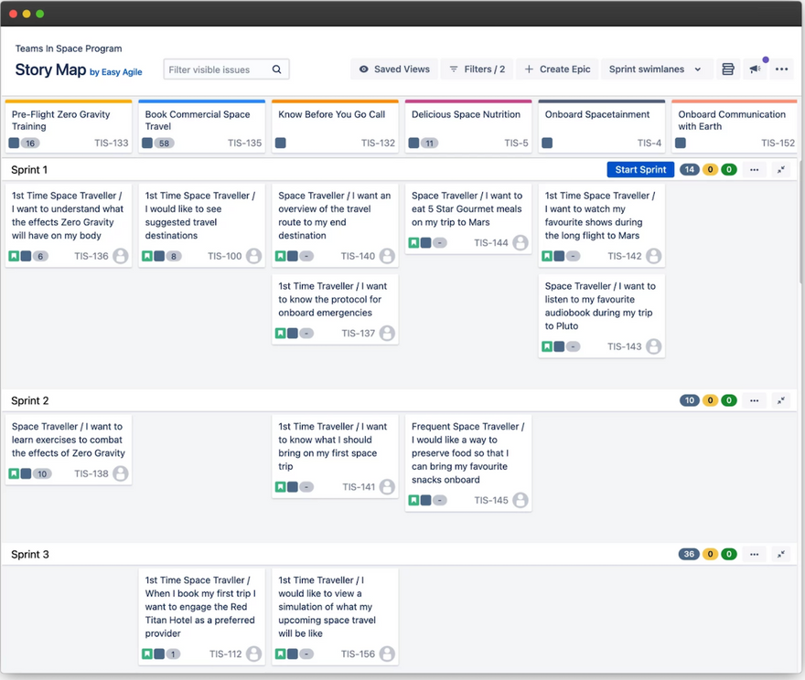
User story maps provide another level of insights into team progress by:
- Showing sprints as vertical swimlanes
- Displaying epics as columns that represent the user journey through the product
This combination of swimlanes and columns unflattens your sprint backlog. It visualizes what the team will deliver and by when.
With Easy Agile User Story Maps for Jira, you can supercharge your ability to make adjustments to your sprint. It can help you:
- Create new user stories
- Edit story points on a user story
- Assign items in the backlog to an epic and a sprint
With this tool, teams can view their sprint statistics at a glance and take action. They can ensure they don't overcommit and that they're on track to achieving their sprint goals. It’s the most comprehensive user story map solution in the Jira marketplace for taking action to adjust your sprints from a big-picture viewpoint.

